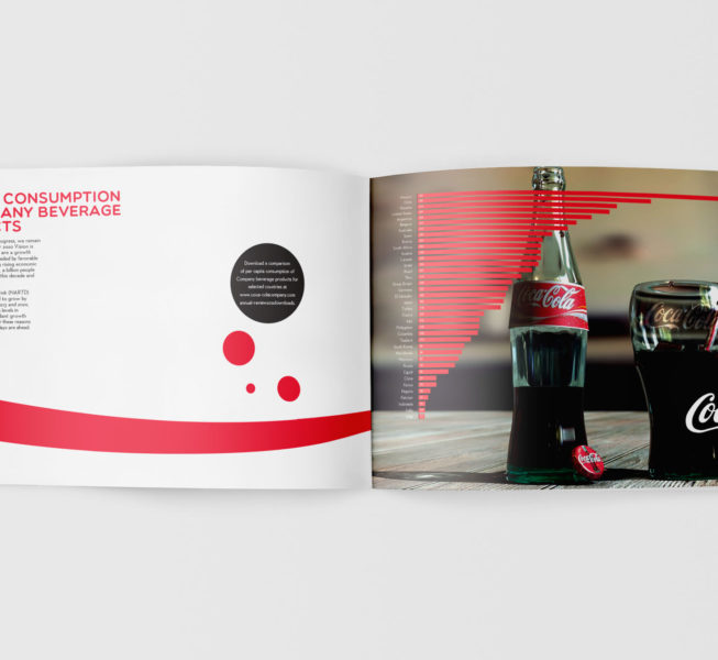
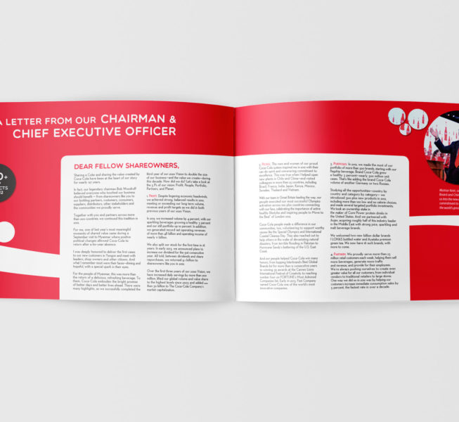
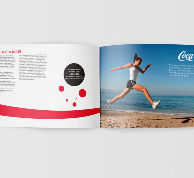
This is a redesigned version of the Coca-Cola annual report. Coca-Cola is known for using high quality imagery in all of their promotions and even in their annual reports. Due to the lack of such imagery for this school project, I created a flat two-dimensional design with a minimal imagery.


